
We design responsive mobile solutions that improves the customers experience when viewing your website, wherever they are.
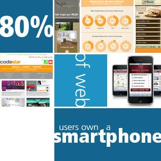
The Multi-screen experience
Gone are the days of people looking at websites on a computer! These days websites are viewed on a variety of devices and screens including smartphone, tablet and TV and they expect a good browsing experience on whichever device they happen to be using. So it is crucial that you consider mobile in your overall web strategy.
As a multi device digital agency, we focus on designing our clients websites for multiple screens and devices to increase engagement from customers.
Mobile Friendly sites help turn users into customers
- 72% of users said that mobile-friendly sites were important to them
- 67% of mobile users say that when they visit a mobile-friendly site, they’re more likely to purchase the service or product
Not having a mobile-friendly site can help your competitors
- 61% of users said that if they didn’t find what they were looking for right away on a mobile site, they’d quickly move on to another site
- 79% of people who don’t like what they find on one site will go back and search for another site
- 55% said a frustrating experience on a (mobile) website would hurt the perception of the brand
Sources: Compuware, “What Users Want from Mobile,” 2011,Gartner, 2010; Google Mobile Optimization Webinar, 2011; Cisco, 2011
Responsive Mobile Websites
Responsive websites use special code to scale and format content to the screen on which the site’s being viewed.
Our own website (this website you are browsing) is responsive; if you resize your browser you can see how the different page elements rearrange to better fit your window.
Responsive design usually means serving the same content on a single web address and builds on the idea of ‘one web’.
Recently Google launched a new algorithm that punishes websites that are not mobile friendly or responsive. Can your business afford not to be seen, no matter how it’s viewed?

 Want to know how your website can help you?